



Walk through Bengaluru’s busiest commercial streets and notice how quickly colour tells you what kind of place you are approaching. A muted stone-and-cream storefront may suggest restraint and refinement, while a bright red-and-yellow sign signals energy, speed and familiarity. Long before a customer reads the name, colour has already begun shaping expectation.
That first interpretation contributes to Brand Perception: the collective impression people form through every encounter with a company. It includes what the organisation says, how it behaves, what others report and how consistently it presents itself. Colour cannot create trust on its own, but it can give the brand an immediate emotional and visual frame.
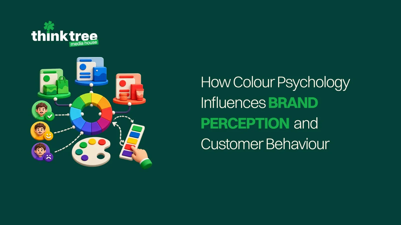
Used thoughtfully, Colour Psychology helps a business select and apply colours that support its positioning, audience and context. Used mechanically, it reduces complex choices to claims such as blue always means trust or red always creates urgency. Effective branding requires a more nuanced understanding of culture, category, contrast and consistency.
Colour Creates Expectations Before It Creates Preference
Human beings notice visual differences quickly. Colour helps people separate elements, identify patterns and decide where to look. In branding, those functions become signals. A palette can make a company feel energetic or calm, accessible or exclusive, youthful or established.
The influence is contextual rather than universal. Green may communicate freshness for a food company, environmental responsibility for a mobility brand or financial progress for an investment platform. The shade, surrounding imagery, typography and message change the interpretation. Cultural associations matter too, particularly for brands communicating across India’s varied regions and traditions.
This is how color psychology in marketing affects behaviour: it changes what customers notice and what they expect from the experience. A contrasting button may attract attention, while a restrained palette may encourage slower consideration. Colour supports the decision environment; it does not control the decision.
Brand Meaning Is Built Through Repetition
Customers rarely develop a lasting association after seeing a colour once. Meaning strengthens when the same palette appears across packaging, social media, advertising, retail spaces and digital products. Repeated, coherent exposure helps a particular shade become mentally connected with the company.
This consistency strengthens visual brand identity by making communications easier to recognise, even before the logo is visible. It also reduces the sense that every campaign belongs to a different organisation. Recognition can shorten the path to trust because the customer sees something familiar in a crowded environment.
Consistency should not become rigidity. Campaigns may introduce seasonal or category-specific shades, but the core system needs enough structure to keep those variations identifiable as part of the same brand.
Choosing a Palette Starts with Strategy, Not Personal Taste
Teams often begin colour discussions with individual preferences: a founder likes black, a competitor uses orange or a particular shade is currently popular. Those inputs may be interesting, but they are not a strategy.
The question of How to Choose Brand Colors begins with the position the business wants to occupy. Define the audience, category, promise, personality and situations in which the identity will appear. A healthcare platform and a streetwear label may both want to feel modern, but the emotional tone, accessibility needs and competitive context will lead to different choices.
A simple process can include four steps. First, identify the characteristics the brand must consistently express. Second, audit category conventions and competitors. Third, explore colour families and combinations that support the intended character without disappearing into the category. Fourth, test the system in realistic applications before approval.
The Palette Should Express a Recognisable Character
The relationship between Color and Brand Identity becomes clearer when colour choices are tied to defined attributes. A bold contrast may support an assertive brand personality, while soft neutrals and measured accents may suit a composed, advisory presence. Neither approach is inherently better; the right choice depends on what the business wants customers to expect.
Primary, secondary and accent colours should also have distinct roles. The primary shade creates recognition, secondary shades provide flexibility and accents direct attention. Neutral colours support backgrounds, text and space. When every shade competes for prominence, the identity loses hierarchy.
Designers should document these roles with digital and print values, permitted combinations and examples of incorrect usage. This makes consistent execution possible across teams, vendors and channels.
Emotional Associations Need Cultural and Commercial Context
A typical colours and emotions chart may link red with excitement, blue with calm, yellow with optimism, green with nature, purple with imagination and black with sophistication. These associations are useful prompts, not guaranteed outcomes.
A pale blue behaves differently from an electric blue. Red on a discount badge is interpreted differently from red across premium packaging. Black can feel refined when paired with generous space and careful typography, but heavy or inaccessible when contrast and readability are ignored. Even the customer’s prior experience with a category affects interpretation.
For Indian audiences, colour also carries strong festive, regional and symbolic meanings. Saffron, red, green, gold and white can acquire very different significance depending on the setting. Research and audience testing help a brand avoid relying entirely on assumptions imported from another market.
Contrast Guides Attention and Action
Colour influences User behaviour most directly through hierarchy. A call-to-action button stands out when it contrasts with its surroundings. Navigation feels easier when selected states are clear. Warnings need to be noticeable without making the entire interface feel alarming.
Contrast must also support accessibility. Brand colours that look attractive in a presentation may fail when used for small text or controls. Testing colour combinations against recognised contrast standards helps more people read and operate the experience. Meaningful states should not rely on colour alone; icons, labels or patterns provide additional clarity.
These choices have a commercial effect. When customers can identify information and actions without effort, they are more likely to continue. The palette works not only as decoration but as part of the interface.
Different Channels Test the System in Different Ways
A colour system must work across bright phone screens, dim indoor displays, printed stationery, outdoor signage, product packaging and video. A shade may reproduce differently across materials and devices, so testing should happen in the formats customers will actually encounter.
Digital channels require scalable contrast and interface states. Print needs accurate production references and allowances for paper and finish. Photography introduces additional colours that can either support or compete with the identity. Motion adds transitions and lighting changes. A flexible system anticipates these conditions instead of relying on one perfect brand-board mock-up.
This is where color psychology in marketing becomes practical. The goal is to preserve the intended feeling while adapting execution to the channel. A campaign can be vibrant on Instagram and restrained in a corporate proposal without losing its central identity.
Testing Reveals What Assumptions Cannot
Colour preference is subjective, but design decisions can still be evaluated. Teams can test recognition, readability, emotional fit and task completion with representative users. Digital experiments may compare how clearly people notice an action, while qualitative sessions reveal the words and expectations a palette evokes.
Results should be interpreted carefully. A button colour that wins one short test is not automatically the best foundation for the entire identity. Strategic consistency and long-term recognition matter alongside immediate response. Testing is most valuable when it answers a defined question rather than searching for a universal winning colour.
Changing Colour Requires a Managed Transition
An established brand should treat a major palette change with care because customers have already learned the existing cues. A sudden shift without explanation can weaken recognition, even when the new system is better designed. The transition should therefore connect the old and new identities through consistent language, logo use, imagery or a phased rollout.
Before changing the palette, clarify what problem the change must solve. The existing colours may be difficult to reproduce, inaccessible on screens or too similar to competitors. A documented reason gives teams a stronger basis for evaluating options and explaining the change internally. Once approved, templates and priority customer touchpoints should be updated systematically so outdated combinations do not circulate indefinitely.
At Think Tree Media, colour is considered as part of a wider brand system involving positioning, language, typography, imagery and experience. This keeps visual choices connected to what the organisation wants to mean and how customers need to interact with it.
Conclusion
Colour influences attention, expectation and memory, making it an important contributor to Brand Perception. Its effect depends on context: the audience, culture, category, shade, contrast and consistency all shape the final interpretation. A strong palette expresses the intended brand personality, supports accessibility and remains recognisable across applications.
If your current colours look appealing but do not communicate a clear position, it may be time to build the system from strategy outward. Over a Bengaluru filter coffee, we can explore what your audience should feel, recognise and remember when they encounter the brand. Contact Think Tree Media to begin the conversation.
