


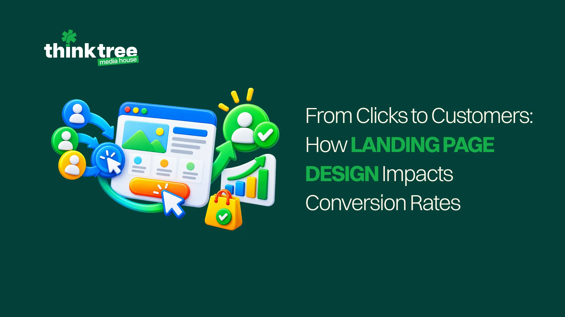
Getting someone to click an advertisement is only half the job. The page that opens next has to continue the conversation, make the offer easy to understand and give the visitor enough confidence to act. If it fails, the business pays for attention that leaves almost immediately.
Effective landing page design brings the campaign message, page structure, copy, visuals and form together around one clear objective. It does not rely on a bright button to rescue an unclear offer. Every part of the experience should help the visitor answer three questions: Is this relevant to me? Can I trust it? What should I do next?
What Makes a Landing Page Different?
A landing page is a focused web page created for a particular campaign, audience or action. Unlike a homepage, which may introduce several services and routes, it usually guides the visitor towards one main outcome such as requesting a quote, booking a consultation, downloading a guide or purchasing a product.
That focus matters because people arrive with an expectation created by the advertisement, email, social post or search result they clicked. The page should meet that expectation without asking them to explore the entire website first.
Understand What a Conversion Really Means
A conversion is the action the campaign wants the visitor to complete. It may be a sale, qualified enquiry, booking, trial registration, phone call or another meaningful step.
This percentage shows how many visitors complete that action:
Conversion rate = Completed actions ÷ Eligible visits × 100
If 1,000 people visit and 40 submit the enquiry form, the result is 4%. The number becomes useful when the conversion itself is valuable. Counting an accidental button click or low-quality submission as a success can make the report look healthy while the sales team sees little benefit.
Define the primary action before designing the page. Smaller actions, such as watching a video or opening a price list, can still be tracked as supporting signals without being confused with the main result.
Conversion Rate Optimization Is More Than a Makeover
CRO is the process of improving the percentage of suitable visitors who complete the intended action. It combines audience understanding, copy, user experience, analytics and testing.
Good conversion rate optimization does not begin with changing a button from blue to red because someone saw a case study about it. It begins by finding where visitors hesitate or leave, forming a sensible explanation and testing a change that may remove that problem.
The following areas have the greatest influence on whether campaign traffic moves forward.
1. Continue the Message That Earned the Click
The page should feel like the natural next step after the advertisement. If an ad promises a free assessment, the headline should mention that assessment. If the visitor clicked to explore a particular product, the page should not open with a general company introduction.
Keep the offer, wording and visual direction consistent. This is often called message match, which simply means that the promise before the click agrees with the experience after it.
Google Ads recommends closely matching advertisements and keywords, then ensuring the page follows through on the same offer or call to action in its landing-page experience guidance.
Do not send every campaign to the homepage for convenience. Different audiences may need different proof, examples and next steps, even when the business is offering the same service.
2. Make the Value Clear Immediately
The opening section should explain what is being offered, who it is for and why it is useful. A visitor should not need to scroll through several paragraphs to discover the point.
A useful opening usually includes:
- A specific headline
- A short explanation of the benefit
- A relevant visual or product view
- One clear call to action
- Important proof, where appropriate
Replace broad claims such as “solutions that transform your business” with language the customer can evaluate. “Get a custom website plan within two working days” gives the visitor a clearer picture of the offer and outcome.
Clarity does not require making the page dull. The idea can still be distinctive; the visitor should simply understand it before being asked to admire it.
3. Give the Page One Main Job
Every extra option competes for attention. A campaign page filled with menu links, social icons, unrelated services, multiple offers and five different buttons can leave the visitor unsure which action matters.
Choose one primary goal for the landing page and repeat the same call to action at sensible points. The wording can change slightly to fit the context, but the destination should remain consistent.
Secondary links are useful when they answer a genuine concern. A case study, privacy policy or detailed specification may help someone decide. The aim is not to remove all navigation blindly; it is to prevent unrelated routes from distracting people from the purpose of the campaign.
4. Use Visual Hierarchy to Guide Attention
Visual hierarchy is the order in which a person notices information. Size, colour, spacing, contrast and placement help show what is most important.
Strong landing page design gives the headline room, makes the primary button easy to recognise and divides longer information into clear sections. The page should feel scannable without becoming a collection of disconnected boxes.
Use contrast with purpose. If every heading, badge and button demands maximum attention, nothing truly stands out. Keep decorative motion away from forms and important explanations, and avoid placing essential copy over busy photographs.
Review the page without reading every word. The layout alone should reveal the offer, supporting reasons and next step.
5. Write Copy That Removes Doubt
Page copy should help the visitor make a decision, not merely describe the business. Explain the outcome, process, eligibility, cost or commitment wherever those details affect confidence.
Use the audience’s language and answer the questions that usually reach the sales team. Depending on the offer, those questions may include:
- What exactly is included?
- How long will it take?
- Who is this suitable for?
- What happens after I submit the form?
- Is there a contract, fee or minimum order?
Do not hide an important condition until the final step. A surprise can increase form starts while reducing completed actions and trust.
Button copy should also describe what happens next. “Get My Quote” or “Book a Demo” is more informative than “Submit.”
6. Keep Forms Proportionate to the Offer
Every form field asks the visitor to spend time and share information. Collect what the team genuinely needs for the next step.
A person downloading a simple checklist may only need to provide a name and email address. A high-value consultation may reasonably require a phone number, company name and short description. The right length depends on the offer and the quality of lead the business needs.
Use clear labels and place them where they remain visible while the person types. Explain errors beside the relevant field instead of displaying an unhelpful “something went wrong” message at the top.
Test the complete submission process. Confirm that the right team receives the information, the visitor sees a useful confirmation and the follow-up message arrives promptly. A beautiful form that sends enquiries nowhere has achieved very little.
7. Add Proof Where the Decision Needs It
Visitors may not know the brand well enough to accept its claims immediately. Relevant proof can reduce that uncertainty.
Depending on the business, this might include:
- Customer testimonials with names and context
- Case studies showing the starting point and result
- Recognisable clients or partners
- Product ratings and reviews
- Certifications, guarantees or secure-payment information
- Clear contact details and company information
Place proof close to the claim or decision it supports. A testimonial about fast implementation is more persuasive beside the process than hidden in a logo strip at the bottom.
Avoid displaying inflated statistics or anonymous praise that cannot be verified. Trust grows through specific evidence, not through adding “trusted” to every heading.
8. Design for Mobile Use, Not Mobile Shrinking
A desktop layout squeezed onto a phone is not a mobile experience. Check whether the headline remains readable, buttons are easy to tap, forms fit the screen and important information appears in a sensible order.
Keep buttons away from one another so visitors do not tap the wrong option. Use the correct mobile keyboard for fields such as phone numbers and email addresses. Avoid pop-ups that cover the entire screen before the person has understood the offer.
Google Ads allows advertisers to review mobile-friendly click rates and page activity in its landing-page performance report. Still, automated checks are only a starting point. Test the page on real devices and slower mobile connections.
9. Make the Page Fast and Stable
Campaign traffic should not be paying to watch a loading animation. Large videos, oversized images, unnecessary scripts and multiple font files can delay the moment when the visitor sees the offer.
Compress media, load below-the-fold content only when needed and remove features that do not support the decision. Reserve space for images and forms so the layout does not jump while loading.
Google’s Core Web Vitals measure three practical parts of page experience: how quickly the main content appears, how promptly the page responds and whether the layout remains visually stable. The technical names matter less to the customer than the outcome: the page should load quickly, react without delay and stay where it was placed.
Speed should be tested after analytics, advertising pixels and other campaign tools have been added. A fast design file can become a slow live page once every tracking script joins the party.
10. Test Behaviour Instead of Guessing
Analytics can show where people leave, which devices struggle and whether visitors reach the intended action. Heatmaps and session recordings can add context by showing where people click, scroll or hesitate, provided they are implemented with appropriate privacy controls.
Use A/B testing to compare two versions of one meaningful element. Half the eligible audience sees version A and the other half sees version B. The result can indicate which version produces more of the chosen action.
Test one clear idea at a time, such as:
- A benefit-led headline versus a feature-led headline
- A short form versus a longer qualifying form
- Customer proof near the top versus later on the page
- A product demonstration versus a static image
- Different call-to-action wording
Do not end the test as soon as one version moves ahead. Allow enough time and traffic to reduce the chance that normal variation is mistaken for a winner. Record what changed, why it was tested and what the result taught the team.
Effective A/B testing is not only about finding winners. An unsuccessful change can reveal that the assumed problem was not the real one.
Use Data to Find the Weak Point
Good landing page optimization starts with the full path rather than the page in isolation. Review the advertisement, audience, page behaviour, form completion, lead quality and final sales result together.
Useful measures include:
- Click-through rate from the campaign
- Page engagement and scroll depth
- Form starts and completions
- Cost per qualified lead or sale
- Performance by device and traffic source
- Lead-to-customer rate
A low conversion rate does not always mean the layout is wrong. The campaign may be reaching the wrong audience, promising something the business does not offer or attracting people who are too early in the decision process.
Similarly, a high result is not automatically good if most submissions are irrelevant. Optimise for actions that create value, not the easiest number to increase.
Treat Improvement as an Ongoing Process
The first published version is a well-informed starting point. Customer expectations, campaigns and offers change, and the page should respond to evidence from real use.
Regular landing page optimization may involve refining the message, removing unnecessary fields, improving speed, adding stronger proof or building separate versions for audiences with genuinely different needs. Keep the visual identity consistent while allowing the experience to become clearer.
Review Think Tree’s guide to website UX mistakes that can cost customers for other usability issues that can create friction beyond campaign pages.
Make Every Click Work Harder
Better landing page design does not trick people into converting. It removes confusion, answers reasonable concerns and makes the promised action feel straightforward. That creates a better experience for the visitor and makes campaign spending more productive for the business.
Think Tree Media combines strategy, copy, design, development and measurement to create campaign experiences built around real customer decisions. Our website development services support responsive pages, testing and ongoing improvements. If your campaigns are earning clicks but losing people before the next step, talk to our team about practical landing page optimization.
