
")


Ever since debates and discussions surrounding arts began, especially ones that are directly consumed by the general public, artists have been facing the conundrum of choosing between content and presentation. When we talk about digital marketing, copywriters argue that content is the king, while on the other side – designers/editors, argue that the design or aesthetics of the creative sells the post.
The answer to this has never been objective, and lack of objectivity leads to inaction. So, for a moment, I would like to agree with them. Let us assume that it is the aesthetics that take a campaign to the target audience.
Most organisations aim to capture the attention of social media users, with a high focus on the internet’s most popular site right now, Instagram. So the aesthetics or the design should appeal to the needs of the Instagram using audience. In what way do the images they see provoke them? Does it lead to some sort of action?
In this postmodern era, where meanings and structures have gone for a toss, the designs and aesthetics tend to lean towards abstraction and minimalism. There are obviously positive and negative sides to this. The designs tease the imagination of the user and trigger them to interpret it in their own way. For instance, if an abstract post reaches 1000 people, it could have 1000 different interpretations. On the flipside, 1000 different interpretations results in at least 2 different actions ranging from boycotting the product to buying the product.
A natural question that has to follow up is – what about posts where the copy/content takes precedence over the aesthetics? On a poorly designed post, the copy directly tells the audience what the post intends to convey. The users may or may not like it, but will not fail to understand it. This is a case of taking a bottom-top approach, where someone who belongs to even the lowest rung of the society understands what the post intends to convey.
Is this because the design is of poor quality? No. The design fails to take into account the cultural and socio-economical shackles the user is bound to. The copy on the other hand, need not necessarily be spoon feeding the audience, but gives their thoughts a direction to think towards. It doesn’t control, but draws boundaries. Morally, boundaries could mean something wrong, but in the world of marketing morality has no place (There are ethics though). All that matters is what we do to retain customers, and ensure they don’t switch to another brand/product.
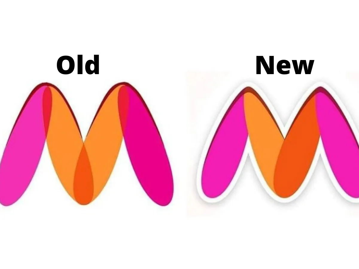
An ideal scenario would be a great copy working in tandem with some fantastic aesthetics, but when we strip one off the other, the copy has less chances to go wrong whereas the risk factor is high in an abstract design. Instead of hypothetical examples, we could support this with a real-time case study. Myntra, an e-commerce company was forced to change its logo after a few users misinterpreted it’s logo for the legs of a naked woman. Consider replacing this logo with just a text that says – MYNTRA. Would many people like it? No. But will people understand what the company is? Yes. To drive home the point better, the copy is the difference between Adidas and Abibas.
To conclude, the aesthetics, and the content, both could end up as kings. They both have their own roles in increasing engagement and call for action. But a king’s legacy depends on what they do ‘for the people’. Not all those who sit on thrones are kings. They are those who create their own thrones in the hearts of people. And the content is… let the ‘people’ decide.
